Optimizing Web Font Usage For Faster Page Loads
So s l o o w w w w
There’s no excuse for this site to be anything other than blazing fast: Relatively (by web standards) low amount of content, few images, and virtually no interactivity. After doing some research, by far the slowest part of loading this website for most users was loading font files. There were two main ones that I cared about:
- Google Fonts - Two typefaces loaded from here: One for titles/navigation and one for the body.
- Font Awesome Icons - These were used for adding in icons for links to Twitter, Instagram, LinkedIn, etc.
I had originally used Google Fonts because it’s trivially easy to get up and running with and has the potential to look way better than using available web safe fonts.
Here’s a look at what Lighthouse scored my site’s /blog path.
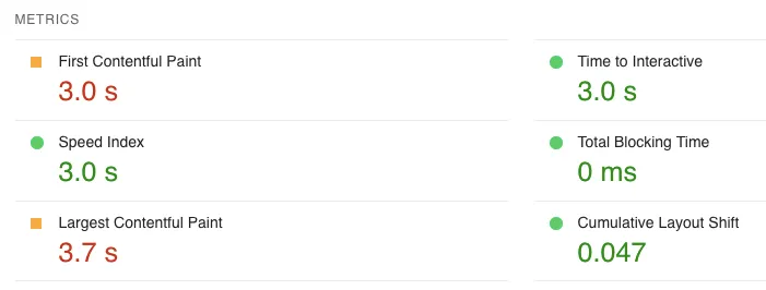
Clearly the biggest issue is the site styling.
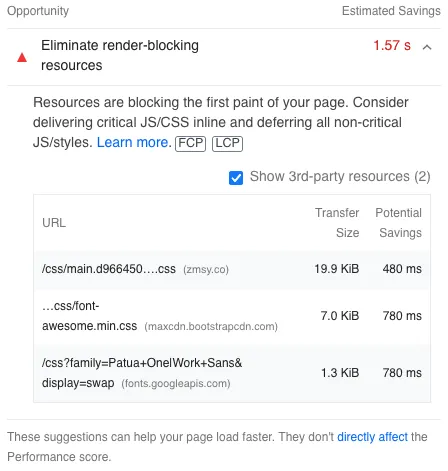
Ignoring the CSS bundle for the time being, let’s look into the two latter items in this list. First is a call to fetch FontAwesome icons, and the second is the call to Google Fonts. These two combine for quite a lot of the time prior to first contentful paint.
Strategies for Improving Site Loading Performance
1. Self-hosting vs. CDN
Since I’ve got not control over the performance of Google Fonts or 3rd-Party CDNs, self-hosting the fonts was an obvious next step. The approach here for text fonts: Use the same fonts from Fontsource instead, and host them as static files. This also helps with user privacy for those on this site. I’m no longer forcing them to connect to Google or other miscellaneous CDNs in order to view the site as intended.
This happened to be a benefit in my case, but it’s not always the right decision. For example, Github Pages doesn’t allow custom cache-control headers, and defaults to a low TTL of 600 seconds, so there are trade-offs between your first load performance and subsequent loads.
2. Reduce File Sizes
There were separate approaches here for either text fonts or icons:
Subsetting your Typeface for Common Usage
The original version of the body font for this site was a big 50+ kilobyte file that contained all glyphs and styles (normal + italic) of the font. For this version, I’m subsetting this font in two ways:
- Two character sets (Latin & Latin-Ext), specified by utilizing the unicode range values provided by FontSource.
- Three specific fonts for this
@font-facerule: 400 Normal, 400 Italic, and 700 Normal. This covers virtually all of my most common use cases.
There’s a great python package named fonttools you can use to create custom subsets to your liking.
Custom Icon Font
For icons (which I had been retrieving using a 3rd-Party CDN), I instead opted to generate a small subset of the icons using a Icon Font Generator. When you download the font, it provides some nice CSS stubs that create a new @font-face rule for the font and examples of how you’d use them.
The end result is drastically smaller than the batteries-included version from a CDN.
3. Load Your Fonts ASAP
Inlining CSS
Based on a suggestion from Lighthouse, I took all of the CSS that declared @font-face rules and inlined it into a separate <style> tag in the header. This way, fonts get requested in just 1-hop after HTML load, and don’t require the additional step of 1. fetch HTML, 2. fetch main CSS bundle, then 3. fetch individual font files. This was my basic first-pass optimization.
<header>
  <style>
    @font-face {
      font-family: "Patua One";
      font-weight: 400;
      font-style: normal;
      src:
        url("/fonts/patua-one/patua-one-latin-400-normal.woff2") format("woff2"),
        url("/fonts/patua-one/patua-one-latin-400-normal.woff") format("woff");
    }
  </style>
</header>
Preload Links
An extremely simple yet effective approach - You can add links into the HTML to preload these fonts. This can have better performance than my first pass above, because preload links come earlier in the waterfall.
<link
  rel="preload"
  href="/fonts/my-fancy-font1.woff2"
  as="font"
  type="font/woff2"
  crossorigin
/>
<link
  rel="preload"
  href="/fonts/my-fancy-font2.woff2"
  as="font"
  type="font/woff2"
  crossorigin
/>
Both of these, used together, are a pretty good starting strategy for font loading. More info on preload links on MDN.
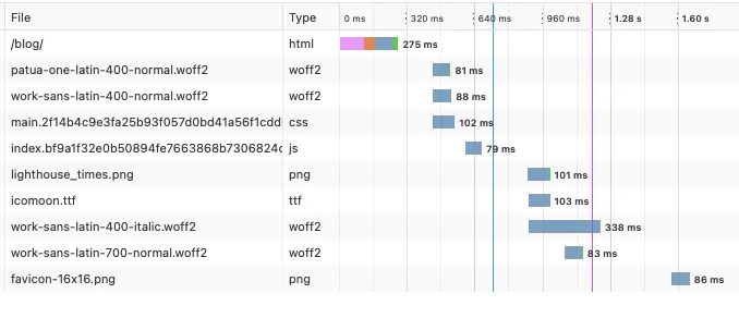
Here’s the before picture, with just the inlined @font-face declarations.
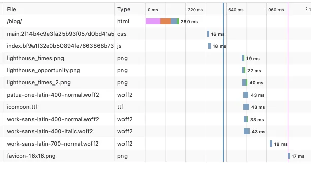
And here’s the result after adding preload links for the two fonts that are most often used.
You can see that the two most important fonts, the 400-weight Latin unicode subset is requested immediately after the HTML is parsed. This makes the FOIT on site load much quicker.
Even Further Optimization
For a really comprehensive approach, you can also preload the smallest possible font containing only the critical unicode ranges to largely cut down on either Flash of Unstyled Text (FOUT) or Flash of Invisible Text (FOIT). Once this is complete, the browser can request the full fonts on its own and FOUT is drastically lessened.
I haven’t gone this far yet.
4. Use System Fonts If Possible
In messing around with this site, I realized that there’s a lot you can get out of the web safe fonts that are available on most machines. If I use the system sans-serif, it looks pretty good compared to my custom body sans-serif font that I’m using already. It’s something to consider. One can absolutely create great designs using only system fonts.
It’s worth at least going through the list and seeing which ones would look good as a fallback in the meantime.
Results
Let’s see how Lighthouse marks this now that the font usage has been improved:

Some real improvements! Some still to be done here, but nothing left within the scope of font usage.
Links & Other Information
- Sort your
url()calls to get font files from most-to-least modern, which for most developers today usually seems to just include WOFF2 first and WOFF second. Past that, there’s rapidly diminishing returns for browser legacy support (i.e. older than IE9). There’s no penalty for supporting older browsers by having additional fallbacks, but the file sizes you’ll serve will tend to be larger. - Use the font-face declaration correctly and you’ll be able to utilize some of the browser’s built-in mechanisms for improving performance for font fetching.
- Look into the
font-displaydescriptor and you can choose between some tradeoffs of style vs. performance. - The CSS font matching algorithm is actually quite easy to understand and will help you grasp the way the browser is choosing which font to show for a particular typeface.
- These are very, very basic optimizations that I used personally. If you’re interested in even deeper dives into the methodology, check out web-font-loading-recipes on Github.